CHAPTER 4
SUPPLY AND DEMAND: AN INITIAL LOOK
TEST YOURSELF
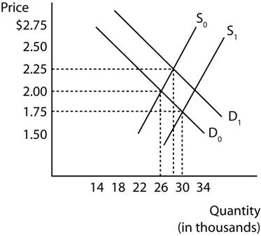
2. The answers to all three parts are shown in Figure 1.
(a) Initially, the equilibrium price is $2.00, and the equilibrium quantity is 26,000 hamburgers, as shown by the intersection of D0 and S0.
(b) The decrease in the price of beef increases the supply of hamburgers, from S0 to S1. So the equilibrium price falls and the equilibrium quantity rises.
(c) Returning to the original supply curve, an increase in the price of pizza raises the demand for hamburgers, to D1. This raises the price and raises the quantity.
Figure 1
6. (a) As Figure 5 (b) shows, the supply of tapes falls from S0 to S1. This leads to an increase in price to P1 and a reduction in quantity to Q1.
(b) In Figure 5 (a), the demand for CDs, a substitute for tapes, rises when the price of tapes rises. Therefore there is both a higher price and a higher quantity of CDs.
Figure 5

7. (a) With a 50-cent tax per pound of beef, Table 2 in the text must be adjusted:
Price Paid by Consumers Price Received by
Farmers Quantity Supplied
(dollars per pound)
(dollars per pound) (pounds per year)
8.00 7.50 90
7.90 7.40 80
7.80 7.30 70
7.70 7.20 60
7.60 7.10 50
7.50 7.00 40
7.40 6.90 30
(b) Using the new Table 4-2, Figure 6 shows that the new supply curve, S1 lies above the original curve, S0, by a distance of 50 cents at each output. The new equilibrium price is approximately $7.76, and the new equilibrium quantity is approximately 47 pounds.
Figure 6
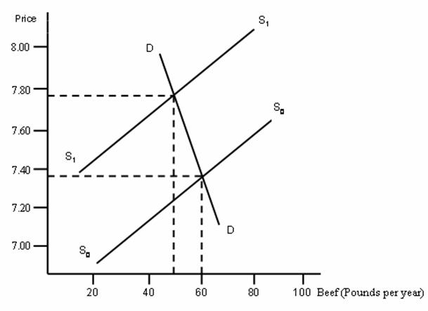
(c) Yes, beef consumption falls by approximately 13 pounds.
(d) The equilibrium price rises by approximately 36 cents, which is less than the tax.
(e) Consumers pay two thirds of the tax, since the price they pay has risen by 36 cents. Producers pay one third, since the price they receive has fallen.
DISCUSSION QUESTIONS
1. This question is intended to help students develop an intuitive sense of the origins of the demand curve. If you deal with this question in class or discussion section, it will be revealing to aggregate the students’ answers, and derive a “market” demand curve. It is also interesting to see whose purchases are sensitive to the price increase, and whose are not, and to speculate upon the reasons for the difference.
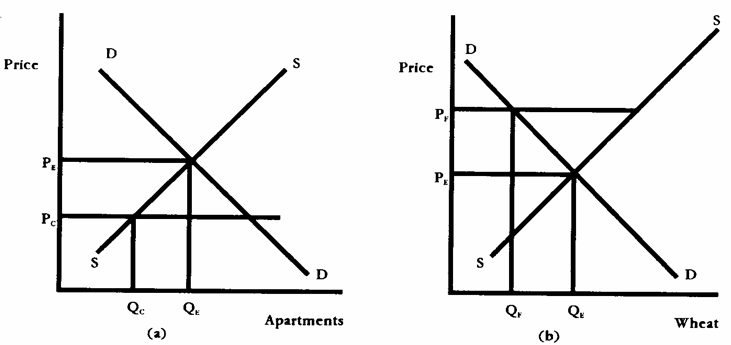
2. (a) Figure 7 (a) is the market for apartments. Without rent control, the equilibrium rent is PE and the equilibrium quantity is QE. When the rent ceiling of PC is imposed, the quantity offered on the market falls, eventually, to QC. At this low rent, there is considerable excess demand, or a shortage, for apartments.
(b) 7 (b) is the market for wheat. Without a price floor, the equilibrium price is PE and the equilibrium quantity is QE. When the price floor of PF is imposed, the quantity demanded in the market falls to QF. At this high price, there is an excess supply of wheat, and if the government is determined to maintain the price floor, it will have to absorb this surplus in one way or another.
Figure 7
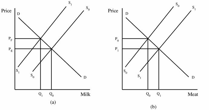
3. In Figure 8 (a), the equilibrium price of milk is PE. The government wishes to raise the price to PF, and it therefore pays farmers to slaughter cattle. As a consequence, the supply curve falls to S1 and the price rises. The market for meat is shown in (b), where the added slaughters increase the supply to S1, cut the price to P1 and raise the quantity to Q1.
Figure 8
5. Figures 10 (a) and (b) show the same increase in the demand curve, from D0 to D1. In (a) the supply curve is quite flat, and the resulting quantity increase, from Q0 to Q1, is large, while in (b) the supply curve is steep, and the quantity increase small. The difference is that in (a) the quantity supplied is very sensitive to small changes in price, while in (b) it is hardly sensitive at all.
Figure 10

7. Explanation (b) is more consistent with the data. If the principal change in the market had been an increase in supply of female workers, i.e., explanation (a), then female wages would have fallen. The fact that they increased while employment also increased means that demand for female workers must have grown.
MAIN PAGE STUDYING MACRO ECONOMICS PAGE